Stereo Bluetooth on iPhone/iPod Touch

img_0615One of the few things that prevents the iPhone and iPod Touch from being the ultimate music device is the lack of A2DP or stereo Bluetooth. I cannot think of any reason that this technology should not be implemented in Apple’s devices. So, as much as I love my iPod Touch, and you know how much I love it, the fact that I cannot use my S9 Bluetooth Stereo headphones with it, really bothered me from day one.

Well, a few days ago, I stumbled upon a possible solution to this issue. I found this Bluetooth adapter for the iPhone/iPod Touch that, when plugged in, enables you to listen to your iPod wirelessly. It wasn’t too expensive,so I had to try it.

After using it now for an hour or so, I have to say, I am a happy man this morning. The thing is awesome. It is absolutely tiny and just barely detracts from the iPod’s simplistic beauty. The sound is as good as it gets and the range is astounding, I listened from another room, and there was no effect on the sound quality.

It is not made by any known manufacturer, unless of course you have heard of K-mate. I searched a lot for the product online, but could not find the exact model that I bought. The closest I could find was this.  I bought it online at Eline, but the product is not even on the site yet, so if you want it, contact them and order it.

img_0606The coolest part is that the controls on the S9 work perfectly. I can lower or raise the volume, pause, play, and skip songs without taking the iPod out of my pocket.

15429_motimage

There are a few downsides of course. The adapter does not fit when my Griffin Reflect case is on, so I am going to have to use the invisible case I bought for it, which by the way, is pretty awesome also. Another down side is that the mic on the S9 does not work with the iPod, but I did not expect it to. So when using audio apps like Fring and iTalk, I will have to go the old fashion way and use my standard earphones with the built in mic. Finally, I have not verified this yet, but it is safe to assume, this will decrease the battery life significantly, but it is so worth it.

-Hillel

img_0611

Add to FacebookAdd to DiggAdd to Del.icio.usAdd to StumbleuponAdd to RedditAdd to BlinklistAdd to Ma.gnoliaAdd to TechnoratiAdd to FurlAdd to Newsvine


CES: Palm, Apple, and Tech N’ Marketing

CES is coming up and that means a few things for you and me. First of all, it means that you will be able to come here to view/read about the latest news from the show because we have someone who will be blogging from Las Vegas for us.  The other piece of information that will become clear to us is that there is no, and never will be an iPhone Nano (right Apple? You are not really going to shrink the esthetically pleasing iPhone, are you?)

iphone-9

CES also means that we will finally know whether Palm really has something significant for us or if they’re closing down shop. Those are the only two options as far as I can tell, because if Palm’s announcement is not something absolutely huge, I am talking iPhone or G1 huge, then we can all say goodbye to the maker of the famous Treo.

pr_650_device

There is no question that Palm is getting our hopes up and the word on the street is that they will be annoucing a totally new OS with at least one new device but probably more. They are making some huge steps in the right direction, there is no question about that. They just launched their on-device application store for both Windows Mobile and Palm OS devices. They are calling it “The Software Store”, how original.

picture-61

According to Mobile Crunch, Palm’s new OS will be called Nova, and will try to fall somewhere in the middle of the business oriented RIM and the fun oriented iPhone. I am not sure I agree with that assessment, RIM is not so business oriented, with their Storm, and the iPhone is not only fun oriented, with its push mail and GPS.

palmnova

There is no question that whatever Palm announces, it will be big, the only question is, will it be big enough? They just replaced their CFO and they are releasing all kinds of teasers to the press so it looks like they are trying to make it REALLY big.

12-15-08-palm-hq

I was never a big fan of Palm, my wife had the Tungsten II, which was pretty lame, and I for one, never really understood the appeal of the popular Treos. If Palm achieves their obvious goal of competing with Apple and RIM, and they introduce a new awesome OS along with a device that has a really large touch display with all the goodies we have grown so accustomed to, I will be the first in line.

-Hillel

palm_logo1

Add to FacebookAdd to DiggAdd to Del.icio.usAdd to StumbleuponAdd to RedditAdd to BlinklistAdd to Ma.gnoliaAdd to TechnoratiAdd to FurlAdd to Newsvine


Congrats to Tech N’ Marketing, But Not to Nokia

Before we discuss the latest and greatest cellular developments, I just wanted to say that this is the first post on the new hosting, it took long enough, but it is finally live, so congrats.

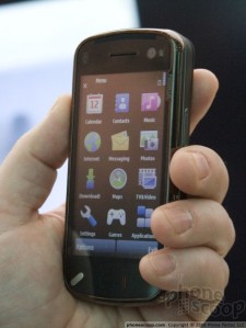
There have been various things going on in the tech world and specifically the cellular market, but I think everyone agrees that one of the biggest and most important pieces of news is the N97. I know I wrote a lot about it already, but  a lot more is known to us now, so I think another N97 post is in order.

live041

Mobile-review had some time with the N97 and although the commercial device is not available yet, so the final version of the software cannot be analyzed, the amount of time they spent with the device is more than the rest of us are getting, so it is pretty exciting.

I read the whole review and what I came away with is that the N97 is first of all a very impressive device. It is not as thick as I originally thought, the screen is pretty outstanding, the widgets are a cool idea, and the battery life is phenomenal.

compare01

N97 Compared to the iPhone

On the flip side of things, and I guess the flip side is what matters because these are the aspects that will prevent me from buying it (yea right, as if I could afford it), there are more than a few things that bother me about the device. Let’s start with the design. I would have liked it if the entire thing was not made out plastic, a little metal would have made things a lot more impressive and serious.

pic3

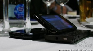
Not sure I am feeling this 35 degree angle thing, did not work for the Tilt, not sure it will work for this. Then there is the whole resistive screen issue, which to be honest, I do not fully understand yet, but it is supposedly a big downside for the N97. From the video below (might as well put your volume down, unless of course you speak Russian), you can see that the interface, which by the way sorry to say, just cannot be compared to Apple’s (I wanted to see if I could write a review without the I word) is a little quirky, but again, this is not the commercial version, so that might change.

compare02

N97 Compared to the XPERIA

I am not getting why the N97 cannot be charged via USB, why would Nokia do that? Am I missing something? As for the widgets, it is a cool idea, but if I wanted widgets, wouldn’t I want them fully customizable? If I were so inclined to have home screen widgets, I would turn to Cellogic to design em, and use Flyscreen.

flyscreenlogo-largeconverted

Two more things I do not like about this phone is of course, the price, but more importantly, Nokia’s marketing strategy really bothers me. The 5800 just came out! I have heard of competition between cellular superpowers, where one outdoes the other and makes consumers forget about the first one’s phone that was recently released (did you get that?). What I have NOT heard of is a company stealing its own thunder. This is something Apple would never do. Why would anyone in their right mind go out and buy a 5800 now, knowing its big brother is right around the corner? Nokia would say they are targeting different audiences with the two phones and to that I say, B.S.  Are you telling me there are 5800 people out there that do NOT want a full QWERTY, 5 mp camera, or home screen widgets? Cmon.

compare04

N97 Compared to its Little Brother

I, for one, was very excited about the 5800, but now that the N97 has a bigger screen, a better OS, and a full QWERTY, I would not consider getting the Tube anymore. Correct me if I’m wrong, did Nokia just convince me not to get a Nokia phone? Now, that’s good marketing.

-Hillel

Add to FacebookAdd to DiggAdd to Del.icio.usAdd to StumbleuponAdd to RedditAdd to BlinklistAdd to Ma.gnoliaAdd to TechnoratiAdd to FurlAdd to Newsvine


Lenovo and Skype Enter the Cellular Market

Not much going on, so I thought I would just report a few small pieces of news. First of all, a mysterious picture showed up on the Web of an unknown Lenovo cellphone. I am a big fan of their laptops so this picture caught my attention. The phone will supposedly run on Android, which makes it the G2?

lenovo-ophone

I am calling it the G2 because it will be the second Google phone, but from the looks of it, it cannot possibly have very much in common with the G1 or the HTC Dream, so to even put them in the same category is a little funny.

Absolutely nothing else is known about this device, but I say, if Lenovo is entering the cellular market, that means more players, cheaper prices, and better phones for us.

In other news, I do not usually take interest or post about these little cute inventions, but this just struck me as borderline genius, so I figured I would share it.

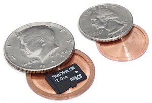
23441-450x-spycoinsYes, that would be a hollow coin, in which one can store/hide their Micro SD cards or any other really small memory card. I just thought that was really innovative and pretty cool.

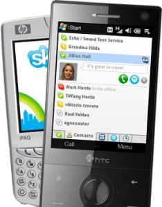
Lastly, looks like Skype launched a beta version for Windows Mobile devices. Not sure what took so long, but I guess this is a good development. On the other hand, not sure why anyone would want to use this, with programs like Fring and others that include Skype, MSN Messenger, AIM, Gtalk and more, why would someone use an application that limits you to your Skype friends exclusively?

-Hillel

12-11-08-skype_25winmo

Add to FacebookAdd to DiggAdd to Del.icio.usAdd to StumbleuponAdd to RedditAdd to BlinklistAdd to Ma.gnoliaAdd to TechnoratiAdd to FurlAdd to Newsvine


sNAX Makes You Forget Joost; For Now Anyway

265x265px-ls-horizontal-celeb-view_iphon

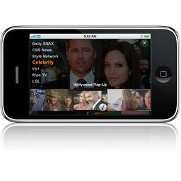
I recently posted about a well knows app called Joost. Joost allows you to watch videos online using your iPhone or iPod Touch. As I wrote in that post, Joost has a few quirks that need working out. Well, they have been worked out. The result is vSNAX. OK, that’s not the result, it is a totally different app, but it is leagues above Joost in almost every way.

vSNAX lets you view a guide where you can easily see what is playing (they are not really playing, it is more like what is available, but it totally reminds you of a TV experience) on the tens of channels offered. The available channels include CBS, Discovery, VH1, Trailers, Comedy Central, Celebrity, Box Office News, and many more.

img_0005

You can also navigate by choosing a specific channel and watching the clips continuously, or click on the Most Viewed tab and watch the popular videos. There are many other options available, such as highest rated and others. The interface is very intuitive and user friendly. The app responds fast and the videos are high quality.

The only down side that I can see right now is a few extra seconds to load up the videos, and the lack of some of the content available on Joost.

vsnax_clip_browser_rhythm-newmedia-logo2

Another very cool feature is the ability to browse clips while you are watching a video. It shows up as a filmstrip on the bottom of the screen and using your finger (of course) you can smoothly navigate through the available videos on the selected channel or select a different channel.

vSNAX is a great app that blows its competition out of the water, although, it is not perfect, as it needs a little more content. The winner will be decided by whether Joost works out its issues or vSNAX signs more contracts. Whichever comes first will win this war.

The only huge drawback of this app is well known to the developers themselves. In fact, it is written on the vSNAX’s iTunes page.  “Warning; may cause obsessive daily SNAXing”.  I think that is an understatement, I have not watched so much stand up comedy in a long time.

-Hillel

Add to FacebookAdd to DiggAdd to Del.icio.usAdd to StumbleuponAdd to RedditAdd to BlinklistAdd to Ma.gnoliaAdd to TechnoratiAdd to FurlAdd to Newsvine


Best iPhone/iPod Touch Apps

iphone-app-store2Apple recently passed the 10,000 apps downloaded from the App Store, which led them to the decision that releasing the stats about the most downloaded apps is a good idea. The apps are split up into categories including Top Paid Apps, Top Free Apps, Top Games (free and paid), Top Social Networking Apps, and many more. You can read the full breakdown here.

I was not really surprised by any of the apps on the list, I already had most of them, which leads me to the topic I want to write about, my apps.

I am not going to write about the useless and ridiculous apps that are on my iPod like Bubble Snap or istethescope, not to in any way detract from the huge amount of entertainment they provide, but I will focus more on the great utilities and games that I think you will enjoy. So let’s get started.

Scramboni: I just found this game last night and I have to say this game is almost as addictive as Labyrinth. It is definitely more sophisticated. It basically presents you with scrambled words that you need to unscramble in 30 seconds. Your contenders are people from all around the globe so you need Web access (Wifi, Edge, or 3G) to play. Based on the level you choose, you are presented with words of different levels of difficulty and receive points accordingly. Great game. I give it a 4/5.

scramboni-1

AppVee: A very useful app that gives you information on new and popular apps in the app store. Its added value is that it provides a video presentation of each app. I am actually surprised Apple did not implement this in the App Store. I actually found Scramboni using AppVee, so just for that, it deserves a 5/5.

Google Mobile App: I am very disappointed in this app. It generated lots of hype and it just does not do it for me. It might have if the voice search feature was implemented in the iPod Touch, but Google disabled it for some odd reason. Other than that, I would appreciate it if anyone would tell me why one would use this app as opposed to using the built in Google search bar in Safari. I would say 2/5, unless I am missing something.

cooliris: I am not sure what I think of this app yet. I mean it is a very cool concept to display news items as a 3D wall of thumbnails.  I have yet to find a use for this app, I guess if you are a news enthusiast, you can just scroll through the wall and read news items. OK, I guess it is pretty cool. There is also a search function that allows you to search various sites and the app displays the results as thumbnails on the wall. For me this app gets a 3/5.

cooliris_2

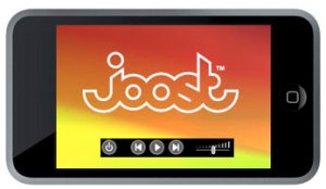
Joost: Joost was one of those companies that when it came out, people thought was going to be the next huge thing. Then came Hulu, which outdid Joost in every category and really did become the next big thing. Until now, that is. Joost’s iPhone app basically gives you TV service and access to many many channels, categories, and specific videos on your iPhone and iPod Touch. There are 46,000 videos on Joost now and the inventory is only getting bigger. The app is a great idea, no question about that, the only problem is, there are still a few quirks that need to be worked out. I give it a 4/5.
1362606889_89ba3359e3_o

Remote: A very cool app made by this small company called Apple inc. This app allows you to control your iTunes library and Apple TV from your iPhone or iPod Touch. Yea, that is pretty much it, but I have to admit, it does it really well, and really impressed me. I give it a 4/5, after all, I cannot really think why someone would need to do this. OK the Apple TV I get, but who has an Apple TV?

I am going to conclude this post with one app that really blew my mind, and I would very much appreciate if someone explained to me how this app works.

midomi: This app is simply amazing. You can search  for any song by typing the name of a song, at which point you are presented with a few options. After you choose the desired song, you can hear a preview of the song, and then quickly download it from iTunes. No big deal, right? Wait! You can also say the name of the song and the same thing happens, but here is the cool part. Hum a part of the song into your mic and it will detect the melody and give you the results. Gets even cooler, simply put your mic near a radio or any audio output of the desired song and it will tell you the song details. Every search, whether typed, hummed, spoken, or grabbed gives you all the information about the song and allows you to quickly download it to iTunes. The app works flawlessly and is one of the most innovative apps I have used so far. This is the kinda app that I would pay for, if it wasn’t free that is. I give this app a 5/5, and if I could, I would give it a 6/5. Check out the video below, it is amazing.

-Hillel

Add to FacebookAdd to DiggAdd to Del.icio.usAdd to StumbleuponAdd to RedditAdd to BlinklistAdd to Ma.gnoliaAdd to TechnoratiAdd to FurlAdd to Newsvine


More Details About the N97

nokia_n97_iphone_3g_1

As more details emerge about this cellular giant, I found myself wanting to keep adding to the last post, so instead I figured I would just post again about the N97.

gsmarena_001

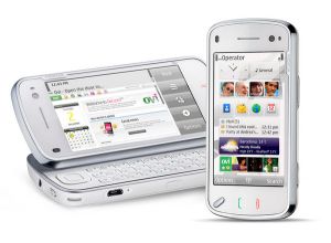
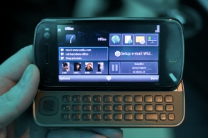
The N97 will be the first high-end device powered by the latest touchscreen Symbian S60 OS and will include goodies missing from other high end devices, such as a 3.5mm headphones jack (cough cough, G1), full QWERTY (cough cough iPhone and HD), stereo bluetooth (cough cough iPhone, OK I think you get the coughing thing), an FM radio, Nokia Maps enabled by touch, a digital compass (similar to the G1 I am guessing), an accelerometer,  and a proximity sensor so the screen turns of during calls.

gsmarena_003

Usually, when a new phone is announced, my first instinct is to try and determine what it is missing. WiFI, 3G, good camera?

19471_605

The N97, as far as I can tell, is not missing anything. Who said there is no such thing as a perfect phone?

That's the iPhone 3G on the Left

That is the iPhone 3G on the Left

I think it is safe to say that until someone invents some sort of new technology for cellphones, the N97 will remain on top.

-Hillel

Add to FacebookAdd to DiggAdd to Del.icio.usAdd to StumbleuponAdd to RedditAdd to BlinklistAdd to Ma.gnoliaAdd to TechnoratiAdd to FurlAdd to Newsvine


Nokia’s Making Headlines With the N97

medium_3076857032_c06cb953c4_o

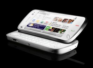
Gizmodo just posted an article stating that Nokia has unveiled the Nokia N97. What is interesting about this piece of information is that it is nowhere else besides Gizmodo (unless you count all the ridiculous results of a Google Search, which produces tens of fake pictures and descriptions of a future N97 that is not nearly as nice or impressive as the actual device). GSMArena has no such device and no other sites are reporting this scoop. Not sure what to make of that, but an N97 was an expected device that seems to have exceeded all expectations.

The device has a tilting screen similar to the Tytn2 or the AT&T Tilt, a smart idea that has not been adapted by any other device since.

n97_shot_1_800

The display is a 3.5″ 640×360 resistive touchscreen and the device has a full QWERTY keyboard, something missing in phones like the iPhone and the HD. The phone has the standard WiFi, 3.5G, 5mp camera with Carl Zeiss Tessar lens and dual LED flash, a-GPS, and supports up to a whopping 48GB of storage with 32GB on board.

medium_3076857114_ed9c8beb11_o

Not much else is known about the phone besides a strong battery life of up to 1.5 days of continuous playback and all sorts of other location-based and social networking goodies that are pretty unclear right now.

Now the big question is, was this Nokia’s big announcement or is there yet another one? Something bigger than an N97? I am doubtful, but if they are revealing this today, what’s with the countdown timer to tomorrow?

-Hillel

Update: After doing a little research, turns out this is Nokia’s big announcement and they are not going to be introducing any other big handsets. Not sure why people kept talking about it all happening on Wednesday, seems like a mix-up in timing (might have to do with different regions and time zones), but in any case, I think this announcement will satisfy anybody and everybody. Oh, and more thing, all the sites now have the N97 up, including GSMArena, but I was first. Nice!

Add to FacebookAdd to DiggAdd to Del.icio.usAdd to StumbleuponAdd to RedditAdd to BlinklistAdd to Ma.gnoliaAdd to TechnoratiAdd to FurlAdd to Newsvine


Wednesday Will Determine Nokia’s Future

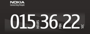
A mysterious little countdown timer just appeared on Nokia’s website. 14.5 hours is the time that appears as I am writing this. That is 14.5 hours until Nokia announces their new and highly anticipated device that will either take away all of Apple’s glory or turn Nokia into another Palm.

12-01-08nokiatease

Nokia executives are very proud of the fact that there is no indication on the Web anywhere what this device will be or what it will offer. I, on the other hand, do not like surprises and I also do not think total secrecy contributes anything to the marketing aspect of this announcement. No leaks, no hype! Am I wrong?

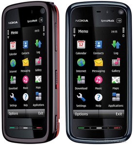
I have to say though, that the 5800 XpressMusic left me wondering how Nokia became the market leader in the first place. When first reading about the device, I found myself asking “This is how Nokia intends to compete with the iPhone? Nokia? This?” Well, I guess my suspicions were right on and they had more up their sleeve the whole time.

nokia-5800-xpressmusic-2

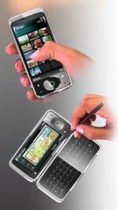
I really do not know what they will be announcing, but my wild imagination says it will be a device with a touch screen display similar to the HTC Touch HD, an interface similar to but better than the iPhone’s. It will offer all the functionality missing in the iPhone, such as copy and paste, MMS, video camera, Flash and Java, a 5 or 8 mp camera, stereo bluetooth, and it will be no thicker than 12 mm. I say if there is anyone out there that can pull this off, it is Nokia.

If the above described device is really announced by Nokia in 14 hours from now, all my contemplation about which handset to buy will have finally come to an end.

-Hillel

nokia-communicator-s60v5-cellpassion

Add to FacebookAdd to DiggAdd to Del.icio.usAdd to StumbleuponAdd to RedditAdd to BlinklistAdd to Ma.gnoliaAdd to TechnoratiAdd to FurlAdd to Newsvine


My iPod Touch Apps

Just thought I would share a rundown of the current apps installed on my iPod Touch. The list is always changing as new apps come out that are more useful.

Easier than a PC

Easier than a PC

  • EasyWriter: Great app that provides a landscape keyboard to type on. I find it much easier to type in landscape mode. After you type the text, you can click on the Mail icon and export the text to an email. Very useful app. I give it a 4/5 just because it is not embedded in the mail client, that would be amazing.
  • Facebook: Very useful app that, after comparing it to the iPhone Facebook website, is a lot more user friendly. I was a little disappointed you could not edit your profile, but all in all, a great app. I give it a 4/5 because it is pretty much read-only.
  • Fring: No question Fring is one of my all time favorites. You can Skype, AIM, MSN, GTalk,Twitter, Yahoo, and ICQ from your iPhone and iPod. Very user friendly interface and a great app. Nothing beats being able to call someone from your iPod via Skype. However, it also gets a 4/5 because of the lack of Facebook chat and landscape keyboard. That would make it the perfect app.
  • So Close to Perfection

    So Close to Perfection

  • Google Earth: Probably the app that blew my mind the most. The graphics on this app just emphasize how truly revolutionary the iPhone’s display really is. Nothing more to say about this app, you know what Google Earth is, I think the iPhone version does everything the desktop version does. Amazing! However, and this is a big however, Apple left out Street View for the iPod Touch, so out of protest, I am giving this app a 3/5. TAKE THAT, APPLE!
  • IM+LITE: Another IM app that allows you to chat in AIM, MSN, GTalk, Yahoo, ICQ, Jabber, and MySpace IM. Why do I need this if I have Fring you ask? One huge advantage in this app is the ability to type in landscape mode. Huge plus for me. However, no Skype and no Facebook chat. 3/5 sounds fair to me.
  • iTalk: Cute little voice recorder app made by Griffin. I have used this on numerous occasions, like when you are on the road or in bed with no pen and you need to jot something down, just record a voice note. Useful app with a great interface including a huge record and stop button. I guess 3/5 as it does not do very much.
Very Not Cool, Steve!

Very Not Cool, Steve!

  • Palringo: Yet another IM app that includes iChat in it’s list of IM services. So why do I need this if I have Fring and IM+Lite? Good question, maybe I will delete it. No, I’m kidding, what this app brings that no others have, is the ability to send pictures to your contacts as well as a voice recording, kinda like a walkie talkie feature. It is actually kinda cool, the thing is,  I found that when I send these audio clips to contacts, they get it as a link and 99% of the time, they are afraid to open it because of the common issue of IM spam. I give this app a 3/5, no Facebook, no Skype, and no landscape mode, but still a nice app.
  • RTM: I know Aryeh loves this app, but after a few days of use, I do not share his excitement. Yes, it is probably the best task manager (by the way, I have yet to find a task manager in the traditional sense of the word, you know like the Windows one that shows which processes are running etc.), and it syncs nicely with the Web, but I just do not love the interface, nor do I love the fact that it has a limited license, and after the trial period, you need to pay for it. It’s big advantage as opposed to the other task managers is the ability to write in landscape mode. I give RTM a 3/5.

OK I am going to wrap things up with two great games:

  • Labyrinth Lite Edition: This game is without a doubt the number 1 most addictive game on the iPod/iPhone. Using the accelerometer, you need to get the silver ball into the hole at the end of the maze. The graphics are awesome and it blows my mind how it picks up on your every move with great sensitivity. Disclaimer: Play this thing at your own risk, there is a major risk of wasted time and addiction. This game gets a 5/5.
Highly Addictive

Highly Addictive

  • Mini Piano: A great app that simply puts a piano on your screen and lets you play. Very cute and simple. Nothing else to say about it, watch a demo in the video below. I guess 4/5 due to lack of sophistication.

OK, that sums up my first home screen. I try to keep no more than 4 home screens worth of apps so generally when I download a new app, I delete something from the previous screen. I will post again about the other 3 home screens, but the above apps are most definitely my favorites, hence the fact that they are on the first home screen.

It is also important to point out that I have yet to pay for an app. I simply have not come across an app that was worth paying for or alternatively one that did not have an almost identical free app. When I do, you will be the first to know.

-Hillel

Add to FacebookAdd to DiggAdd to Del.icio.usAdd to StumbleuponAdd to RedditAdd to BlinklistAdd to Ma.gnoliaAdd to TechnoratiAdd to FurlAdd to Newsvine