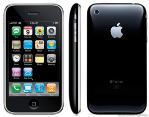
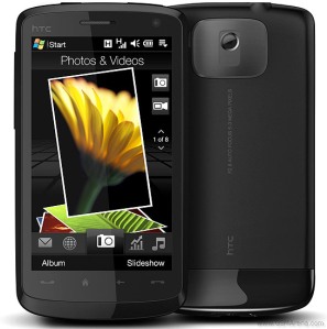
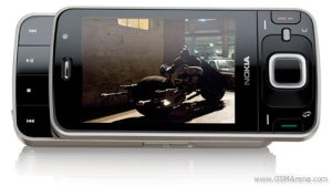
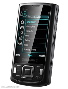
Nobody was surprised today when Nokia officially announced the release of the Tube or the 5800 XpressMusic handset. It is an OK looking handset, I guess. I think, like many other recent announcements, it would have been huge news prior to the launch of the iPhone. I am sure Nokia is kicking themselves now that they did not release this earlier. There is no avoiding the iPhone comparison, and from the short reviews that are out there, it looks like the Tube is just another touchscreen that will stay in the shadow of the iPhone.
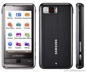
It is true the specs on the Tube are not too shabby. It boasts a 3.2 inch display, 3.2 megapixel autofocus Carl Zeiss camera w/ dual-LED flash, a secondary front camera for video calling, stereo Bluetooth, WiFi 802.11 b/g, and integrated GPS. Those are not bad specs, but do they compare to those of the Omnia for example? Would this phone be generating so much hype without the Nokia branding on top? Not so sure!
Even with its decent specs, CrunchGear spent a few minutes with the phone and was not impressed. What was most unimpressive was the crowded UI and the Web browser. As I have said many times, in today’s market, with pretty much all the big players making amazingly impressive touchscreen devices, what separates the men from the boys is the user experience. Seems that Nokia has their work cut out for them if they want to maintain their market share for much longer.
-Hillel


